An interface is never a neutral surface. Every screen you build teaches a specific rhythm of attention, a quiet pulse that affects the nervous system of the person sitting behind it.
Some interfaces are designed to induce a state of mild, chronic agitation. They employ high-contrast crimson banners, vibrating badges, fake countdown timers, and sudden pop-up overlays. They treat the user’s mind as an advertising territory to be conquered, constantly demanding immediate action. Other interfaces behave like a quiet, well-lit study. They greet you with generous margins, soft typography, harmonious colors, and a complete absence of uninvited disruptions.
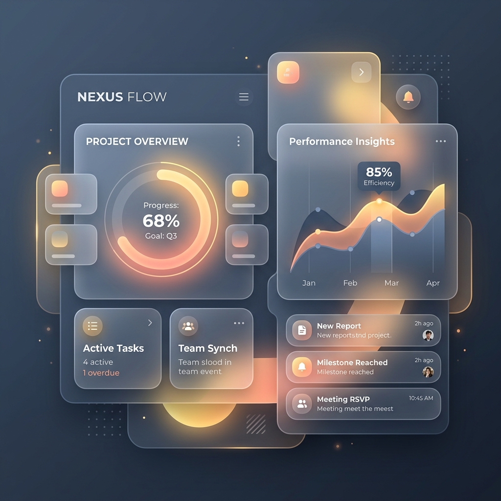
The design of a user interface is not just visual ornamentation; it is the emotional acoustics of the application. It dictates whether using a tool feels like standing in a crowded, noisy subway station or stepping into a peaceful, glass-morphic garden.
The Acoustics of Rounded Corners and Frosted Glass
Why are we drawn to rounded shapes, soft radial glows, and high-blur glass containers?
It is not merely a passing aesthetic trend. In nature, sharp edges represent hazard and threat—the point of a thorn, the edge of a broken rock. Rounded corners, spacious containers, and soft transitions signify safety, comfort, and hospitality. They represent organic forms: the curve of a clay vessel, the gentle gradient of a sunset, the frosted translucency of morning dew.
When we build a interface using these design elements:
- Rounded Cards (
border-radius: 24px): The generous rounding reduces visual friction. It signals to the eyes that this is a safe, friendly space that does not wish to poke or prod. - Glassmorphism (
backdrop-filter: blur(12px)): By creating layers of semi-transparent, frosted panels over glowing ambient background gradients (like our saffron and deep-slate flows), we create a sense of depth and spatial hospitality. The user understands where they are; they feel grounded in a physical, albeit digital, room. - Micro-animations: A button that shifts its glow slightly when hovered, or a modal overlay that fades into view over 200 milliseconds, gives a sense of physical weight and response. The software is alive, listening, and polite.
These details, when combined, create a premium sanctuary. They reassure the user that the creators of this software spent time polishing the details out of respect for their sensory experience.
Removing the Tax of Trivial Decisions
Every time you present a user with a choice—a select drop-down, a checkbox grid, a secondary button path, or a notification prompt—you extract a tiny tax of cognitive energy. Over the course of a day, these tiny taxes compound, leaving the user fatigued, overwhelmed, and disconnected.
┌────────────────────────────────────────┐
│        Humane Decision Architecture    │
├────────────────────────────────────────┤
│   Manipulative (Agitated):             │
│   [Accept] (Huge Bright Glow)          │
│   [Decline] (Tiny hidden grey link)    │
│   (Manipulates, Creates distrust)      │
│                                        │
│   Humane (Calm):                       │
│   [Primary Action]    [Cancel/Close]   │
│   (Balanced weights, Respects choice)   │
└────────────────────────────────────────┘
Humane interface design is the systematic removal of unnecessary decisions. It means:
- Restrained Actions: Provide a single, beautiful primary action button (like our vibrant saffron gradient button) and a clear, secondary border button. Do not clutter the card with four alternative actions of equal visual weight.
- Sensible Defaults: Pre-configure selections, themes, and layouts based on system settings, allowing the user to begin their work immediately without navigating an elaborate configuration wizard.
- No Manipulative UI: Avoid "dark patterns" designed to trick the user—such as making an opt-out link small and gray while opt-in buttons are large and pulsing. A humane interface treats the user as a peer, giving equal dignity to their choices.
Calm Software is Memorable
People rarely describe calm software in dramatic, sensational terms. They do not write viral threads about its features or post screenshot reactions to its notifications.
Instead, they simply continue using it for five, ten, or fifteen years.
It becomes a quiet fixture in their daily work, a dependable tool that sits on their desktop like a well-crafted wooden pencil holder. They trust it because it has never tricked them, never interrupted them in a moment of focus, and never made them feel small. It gave them a visual sanctuary where their coordination, volunteer logs, or writing could take shape in perfect tranquility.
When we build software at Software Seva, we are not just writing scripts and queries. We are building these digital sanctuaries. We are crafting the rounded, glassmorphic arches under which people can work, coordinate, and share with a quiet and peaceful mind.